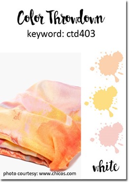
Hello and welcome to this week’s Color Throwdown Challenge! Broni has chosen a lovely pastel color palette for us to work with. 
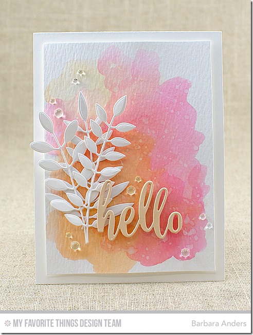
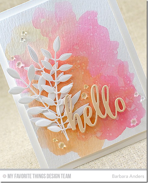
This was a pretty fast card to put together and I really love how it turned out. I started with a Sweet Tooth card stock base, then applied a watercolor wash on Ranger Watercolor Paper using Peerless Watercolors and a waterbrush, then popped it up on the base with foam mounting tape.
Then I added some Bold Greenery Die-namics cut from Sweet Tooth card stock and Thanks & Hello Die-namics cut from In the Buff card stock. To finish off I added some Rainstones.
And that’s it from me! Remember, you do not have to have the exact colors to play the Color Throwdown challenge. If you don't, just use the closest you have. So, c'mon over to the Color Throwdown blog and play along with us this week. Please use the link service to post your card and please link directly to your card so we can find it easily. And please include a link in your post to the Color Throwdown. If you upload your card to a public forum, please use the keyword CTD403 so we can see your beauty all in one place, and use #ctd403 and #colorthrowdown on social media. Hope to see you there! Be sure to check out what the other team members have come up with this week!
Amy Rohl
Amy Rysavy
Barbara Anders (<—You are here!)
Broni Holcombe
Jodi Collins
Lisa Henke
Lori Tecler
Lynn Put
Vickie Zimmer
Wanda Cullen
Kim Singdahlsen – July Guest Designer
Thanks so much for stopping by today! See you soon!
~Supplies~
Stamps: None
Ink: None
Paper: Sweet Tooth card stock, In the Buff card stock, Ranger Watercolor Paper (MFT)
Accessories/tools: Vagabond; Bold Greenery Die-namics, Thanks & Hello Die-namics , Peerless Watercolors, waterbrush, foam mounting tape (MFT); Rainstones


Beautiful mix of colors and the white leaves really pop! Love this card!
ReplyDeleteI love the softness you achieved with the colors! Such a pretty card!
ReplyDeleteBEAUTIFUL WC background, Barbara!
ReplyDeleteThis is stunning! In my opinion/experience it is harder to make the watercolor wash than one would expect, and yours is so eye-catching. Love the white leaves against the soft colors!
ReplyDeleteLovely card. I wish I could watercolor like that.
ReplyDeleteWhen you do the watercolor wash, do you mean that you brush water down on the paper and then add the color? Thank you!
ReplyDeleteJust saw this on Pinterest. It’s a timeless design. Thanks for the inspiration!
ReplyDelete